Visual Identity for Dits App
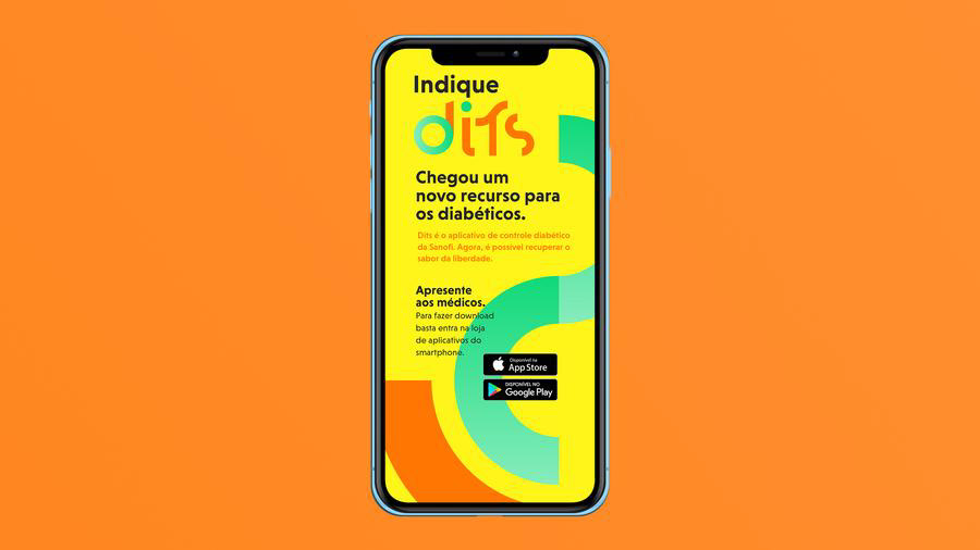
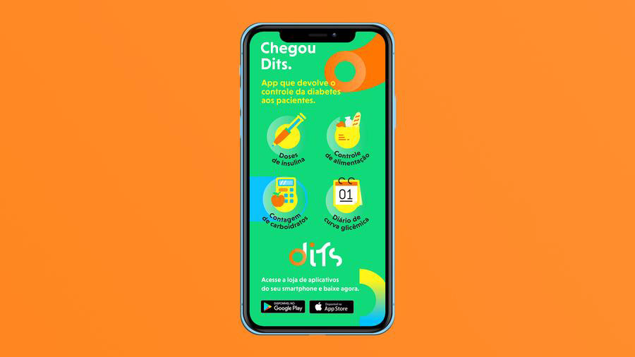
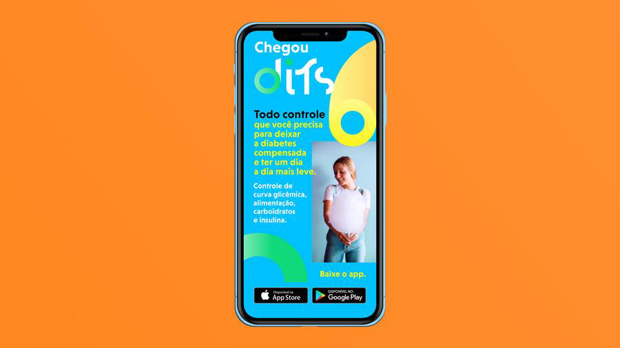
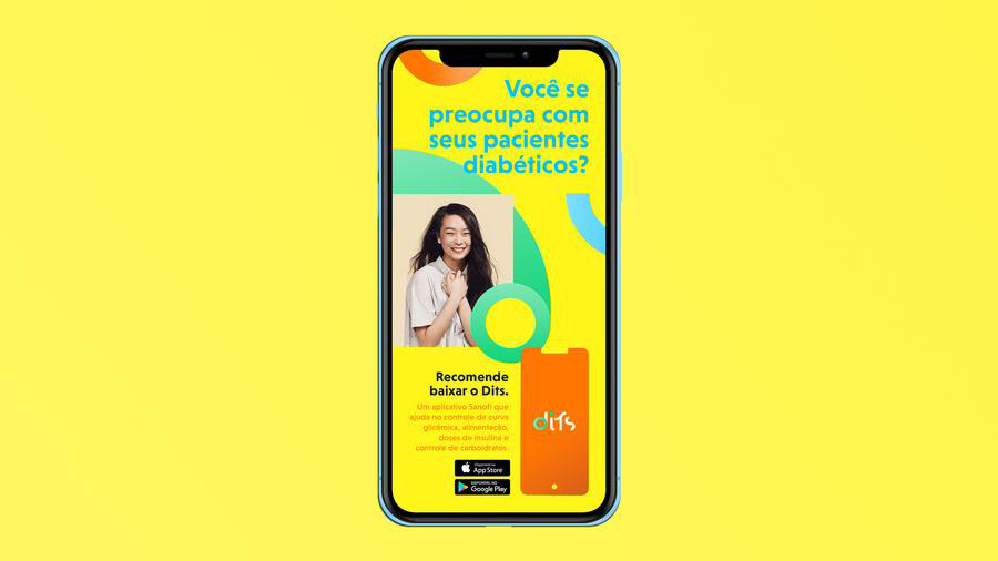
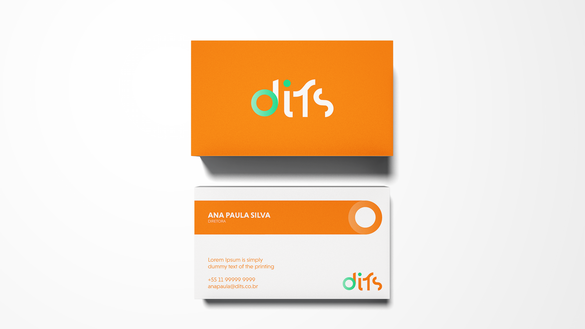
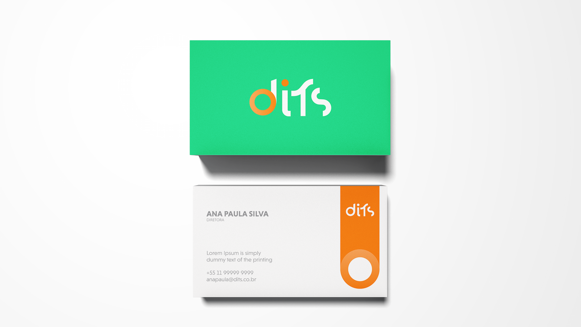
Sanofi already offered diabetes patients an app to make their day-to-day life easier in controlling the disease. With good repercussion and a considerable number of downloads, the laboratory decided that the time had come to boost its popularity with a rebranding that represented the practicality, versatility and accessibility of this technology that has become so important for its users. We created the name, simplifying the word diabetes and “reproducing” the sound of the glucose meter stinging and repositioning the brand, now with more charisma, energy and youthfulness, with a new tone of voice and visual identity composed of citrus and vibrant colors.
Project carried out at the Matta agency